→
Back to home
Equipe Zorgbedrijven
Digital Care Platform for Surgical Patients
Designing a hybrid care platform for surgical pathways
Team: 1 Lead Design, 1 Content, 5 Eng
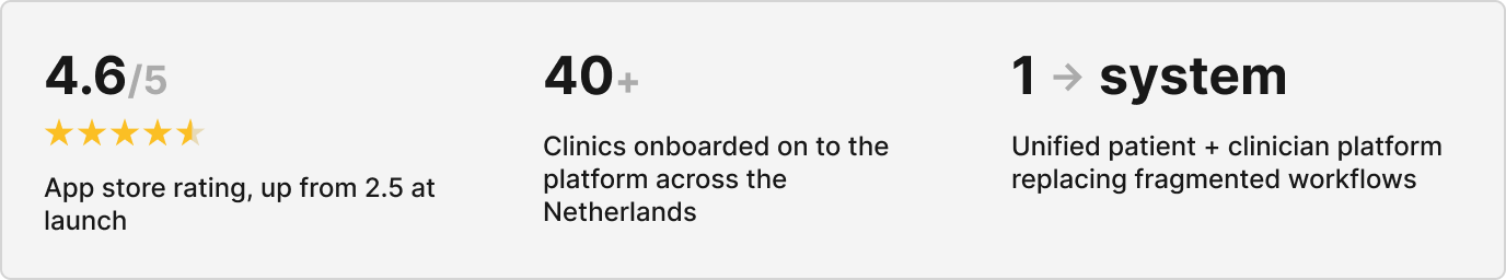
Clinics Served: 40 across the Netherlands
Duration: 2+ years, end-to-end
01. The Problem
Fragmented care across dozens of clinics
Equipe wanted to move from traditional in-clinic medical care to a hybrid digital-first model that allowed patients to better prepare for their treatments and find all relevant medical information they need.
However:
- Patient communication was fragmented
- Pre-operative preparation was inconsistent
- Clinics lacked structured digital workflows
- There was no centralised patient directory
This resulted in:
- Increased admin and help centre desk load
- Missed information
- Lower patient confidence before and after surgery
Going into this project, it seemed that our high-level goal was clear:
Design a secure, accessible digital platform that supports patients before and after surgery while integrating seamlessly into clinic workflows.
02. Role & Scope
Lead designer, post-discovery through implementation
I joined after the initial discovery phase and owned design end-to-end, from shaping strategy through to engineering handoff and iteration in production.
My responsibilities:
- Defined the design strategy
- interpreted research with patients and clinicians
- Designed patient and clinician interfaces
- Established early design system foundations which was later expanded significantly
- Facilitated cross-functional workshops
- Supported implementation with engineering
I worked closely with:
- Surgeons
- Clinic coordinators
- Engineers
- Product stakeholders
💡 I also completed an Introduction to Medical Software course during this project, deepening my understanding of clinical workflows, regulatory constraints, and patient safety considerations.
03. Discovery & Insights
Embedding research within clinical constraints
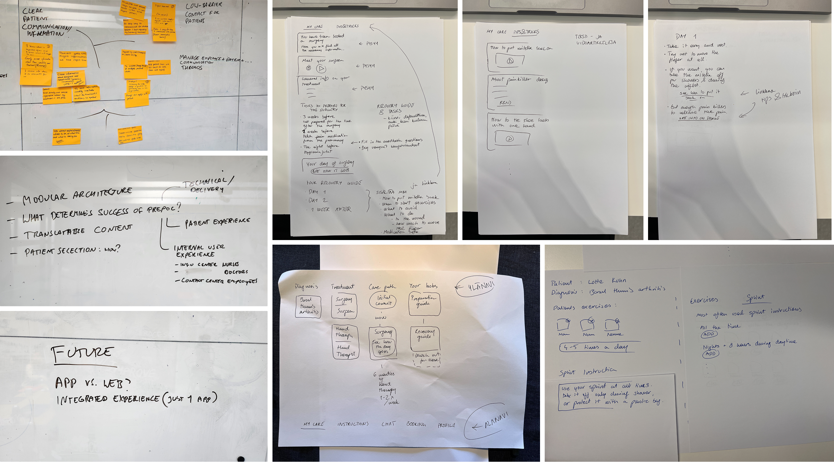
Approach
Before designing features, I focused on understanding clinical workflows and patient anxieties around surgery and clinical procedures. Due to regulatory and operational constraints within clinical environments, formal user research opportunities were limited during early phases.
To mitigate this, I embedded discovery into ongoing collaboration with surgeons, coordinators, and support agents.
This included:
- Patient journey mapping
- Review of existing documentation and care flows
- Documentation audits
- Continuous feedback loops during rollout
- Iterative validation through live usage
As much as I would have liked more time and resources to support research phases more fully, I found that rapid iteration and stakeholder immersion were effective enough for me to make design decision confidently.
A few Key Insights identified early on:
- Patients felt uncertain and underprepared before surgery
- Clinics relied heavily on manual and fragmented forms of communication
- There was no standardised digital workflow across clinics
- Surgeons needed structured patient data before consultations
- Accessibility was critical due to varied patient demographics
04. Framing & Strategy
Reframing the challenge
Based on discovery, I reframed the challenge:
From: “Build a standardised and cohesive patient app.”
To: “Design a connected digital care system that supports both patient confidence and clinical efficiency.”
💡 The shift from "app" to "system" was significant. This wasn't a product problem, it was an infrastructure problem. Both sides of the clinical relationship needed to be designed simultaneously.
Strategic priorities:
- Centralised communication: One place for patients and clinic staff to exchange information securely
- Structured intake & triage: Ensure surgeons receive complete, organised patient data before every consultation
- Scalable multi-clinic workflows: Design for 40 clinics with varying needs, without 40 separate solutions
- Accessibility-first: Ensure usability across a wide range of ages, languages, and digital confidence levels
05. Design Execution
Features built across two years
Above you can see how our product evolved over time. We often worked on multiple features simultaneously which required our team to develop reliable workflows and a strong sense of trust that helped us in times of rescoping.
Some of the most significant areas of work included:
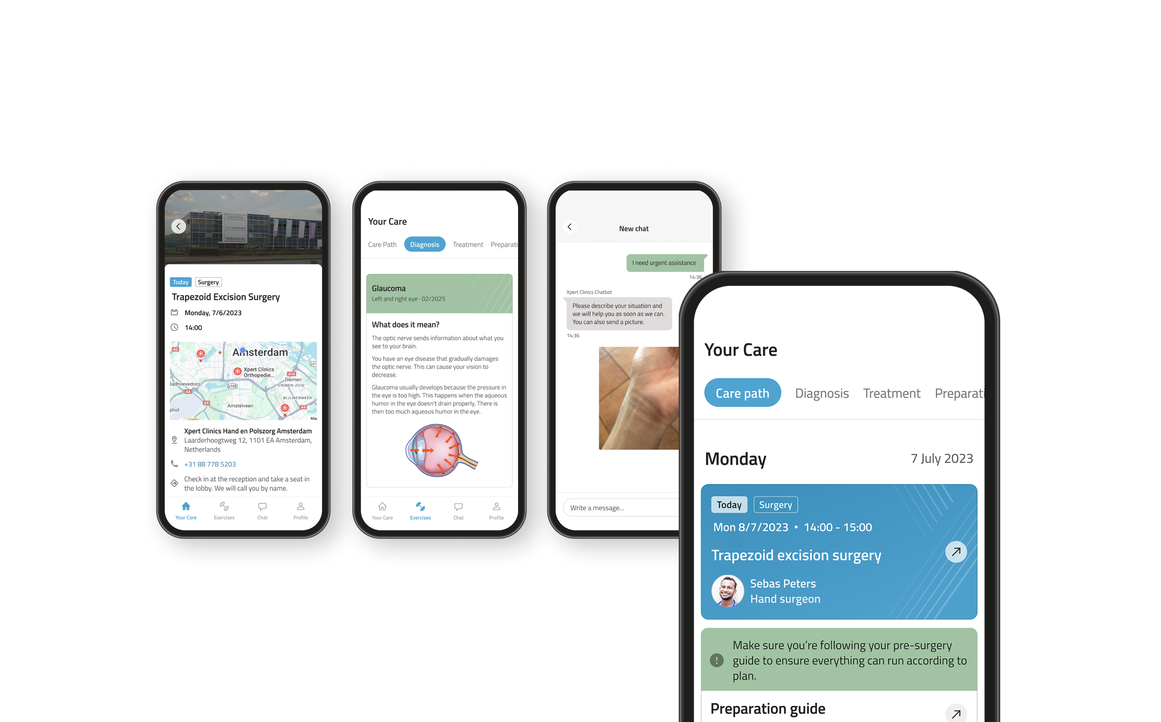
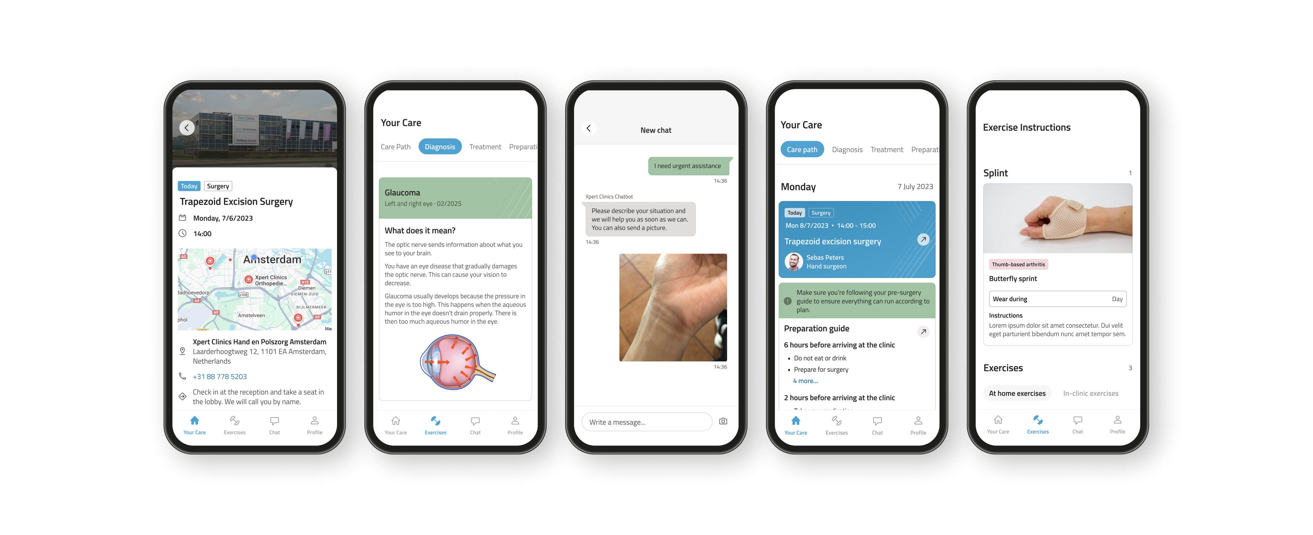
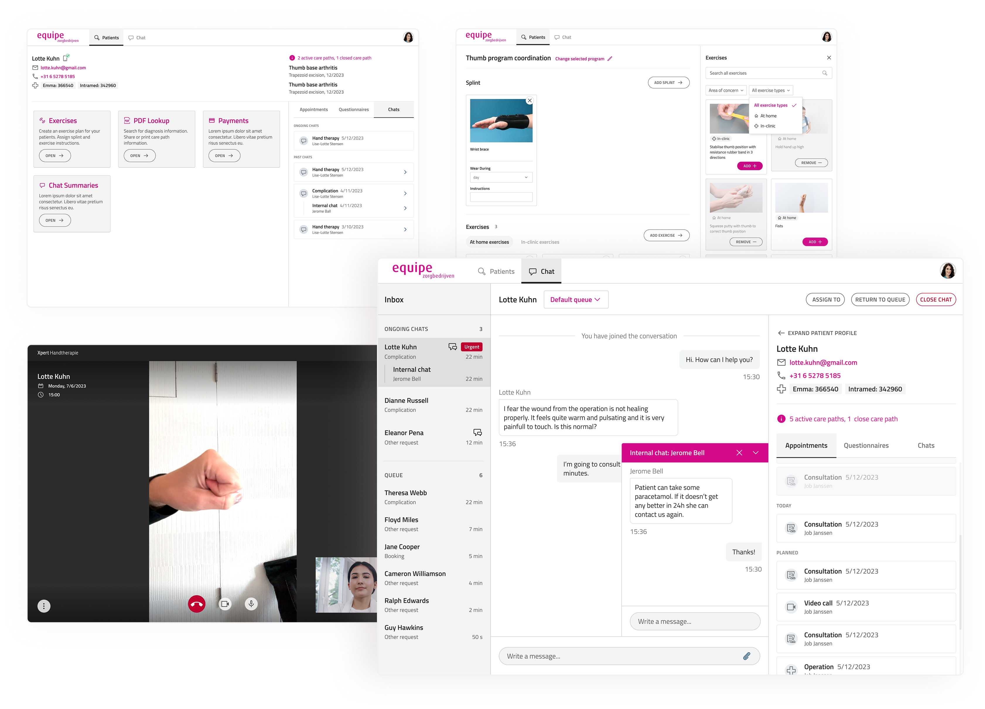
Care Pathways
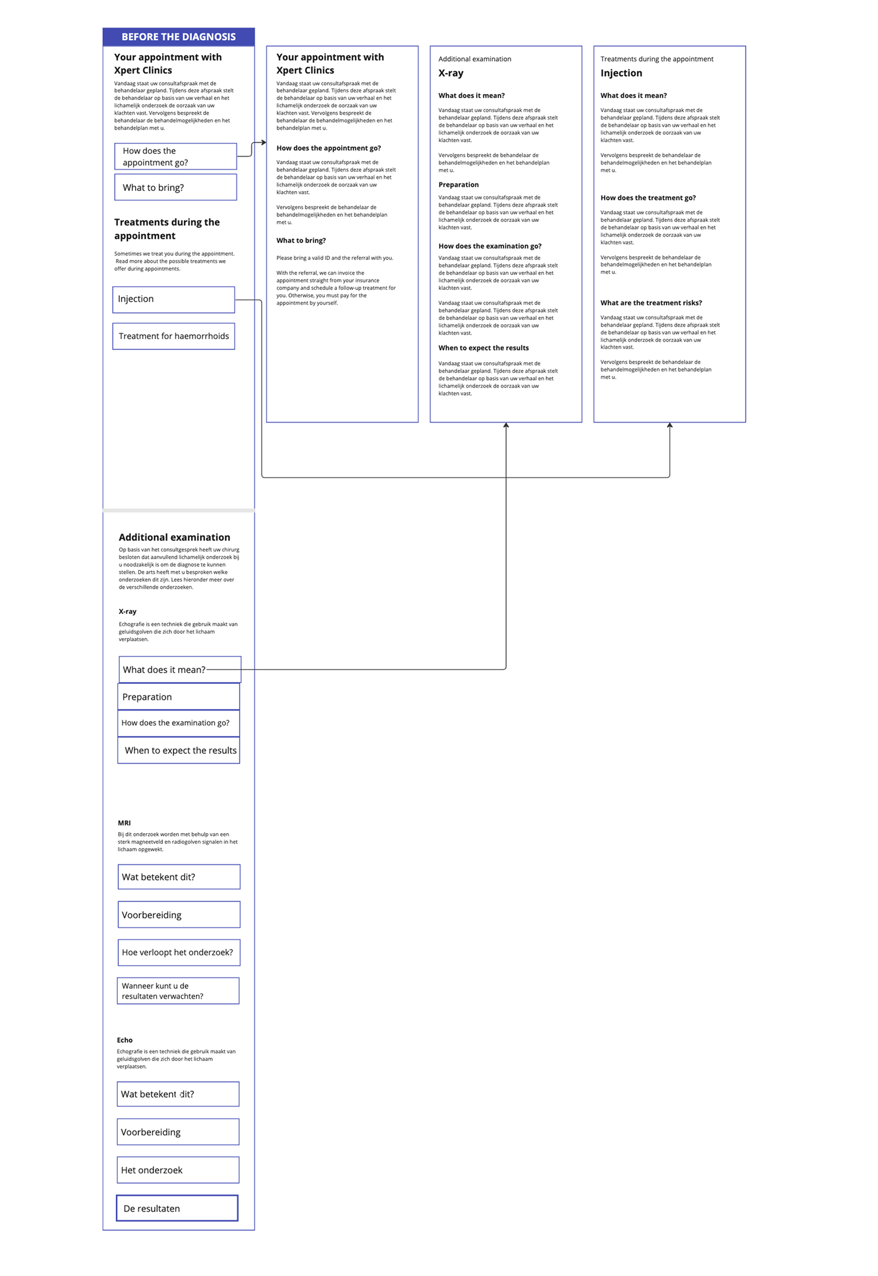
Guided care journeys for patients
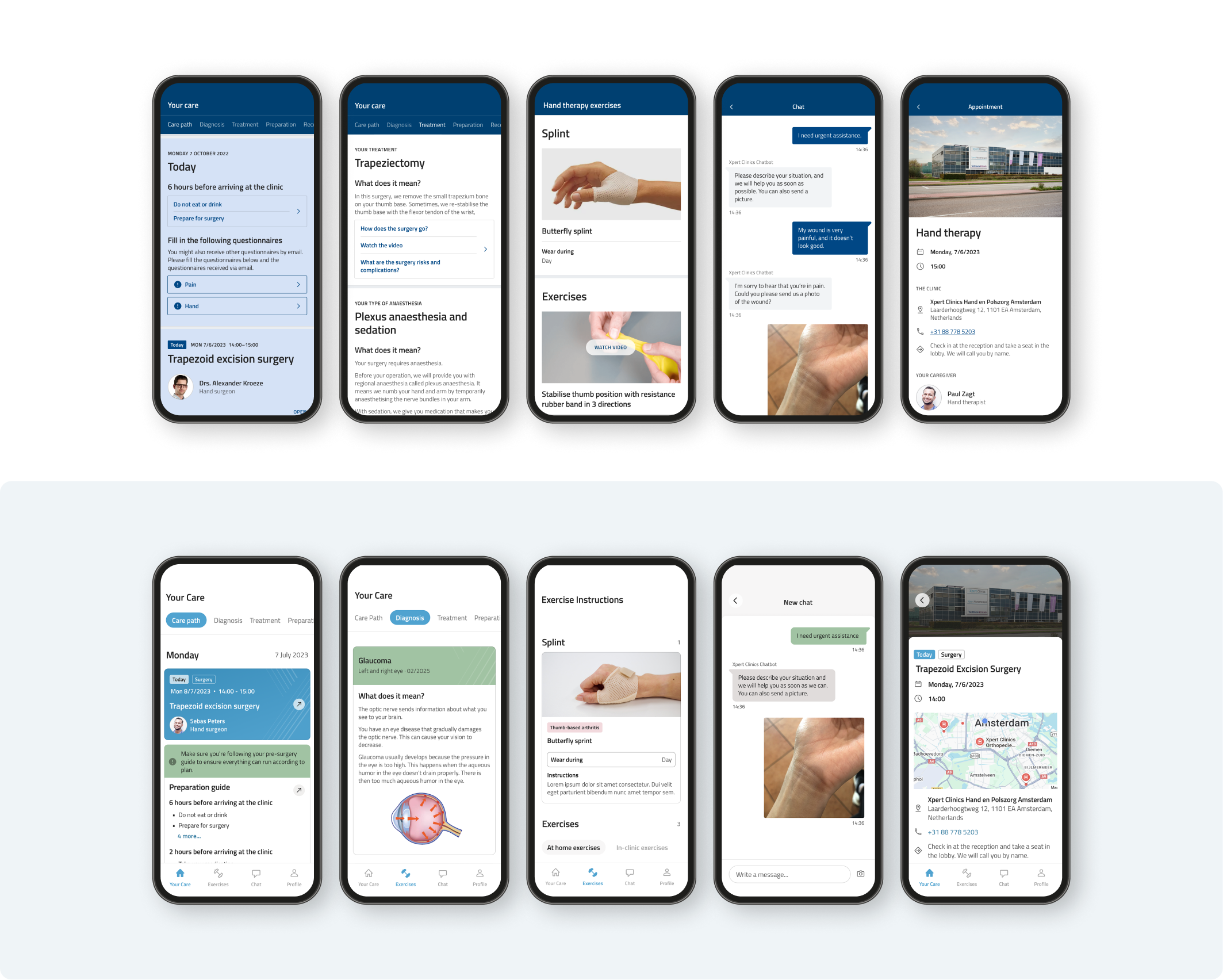
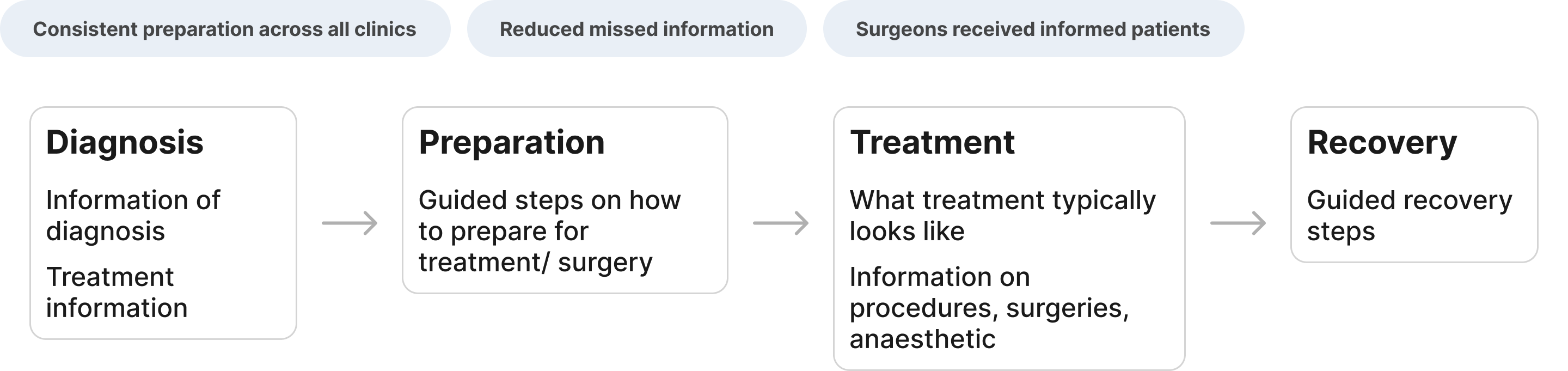
Patients lacked a clear picture of what to expect before, during, and after surgery. We redesigned the care journey into a structured, step-by-step experience inside the app.
Communication system
Centralised messaging: for patients, agents, and clinicians
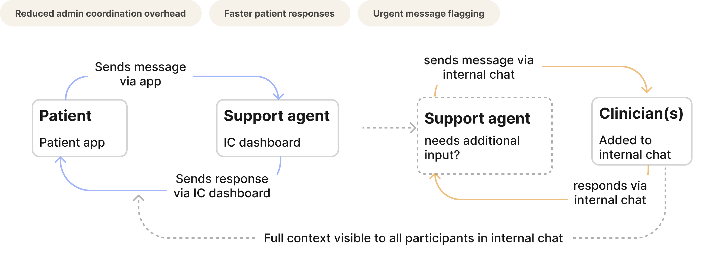
The most complex feature: a three-way communication system where patients could message their clinic, support agents could loop in clinicians via internal chat, and everyone had full contextual visibility.
Clinician tools
Patient directory & admin dashboard
Surgeons had no reliable way to access patient history before a consultation. I designed a structured, searchable patient directory and clinician dashboard that standardised information access across all clinics. I also implemented functionality on the clinician desktop app that therapists could use to assign recovery exercises or build exercise programs for patients post-treatment. Later this was also improved upon by implementing filterable search feature to make it easier to find exercises.
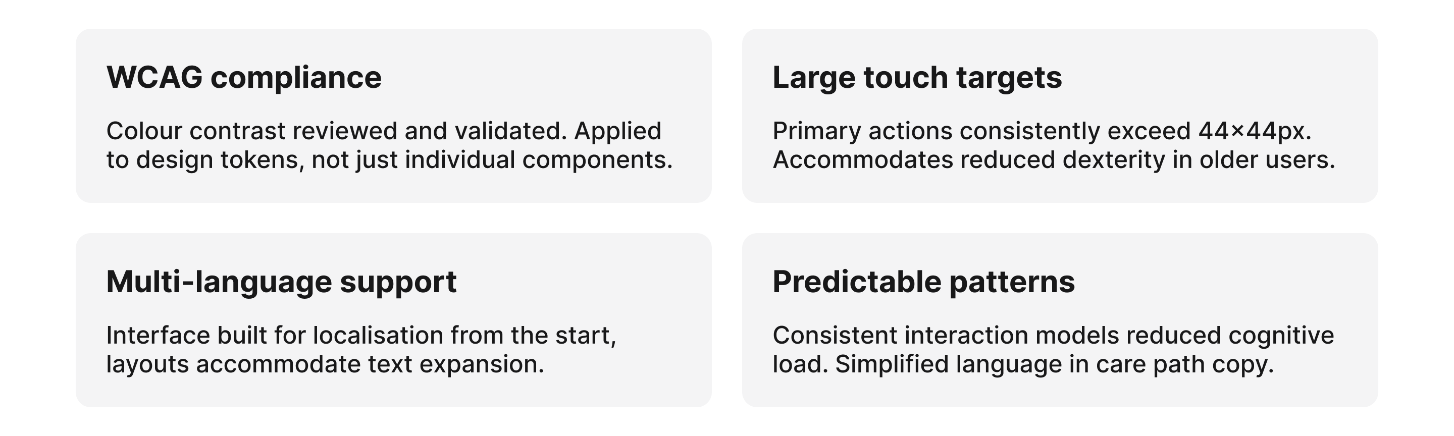
Accessibility
Designing for a wide demographic
Patients ranged from younger, digitally confident adults to older patients with limited tech experience. Complex interfaces would actively exclude a significant portion of the user base.
06. Outcomes
What we shipped and what it changed
Quantitative Impact
- Thousands of patients onboarded to our new system
- Reduced admin overhead
- Increased consistency from preparation through to recovery
- Established robust design system that was easily adapted when the company decided to rebrand in 2025*.
- rating on app store went from 2.5 to 4.6
Qualitative Impact
- Improved patient confidence
- Better surgeon preparedness
- Established digital foundation for expansion
- Standardised workflows across clinics
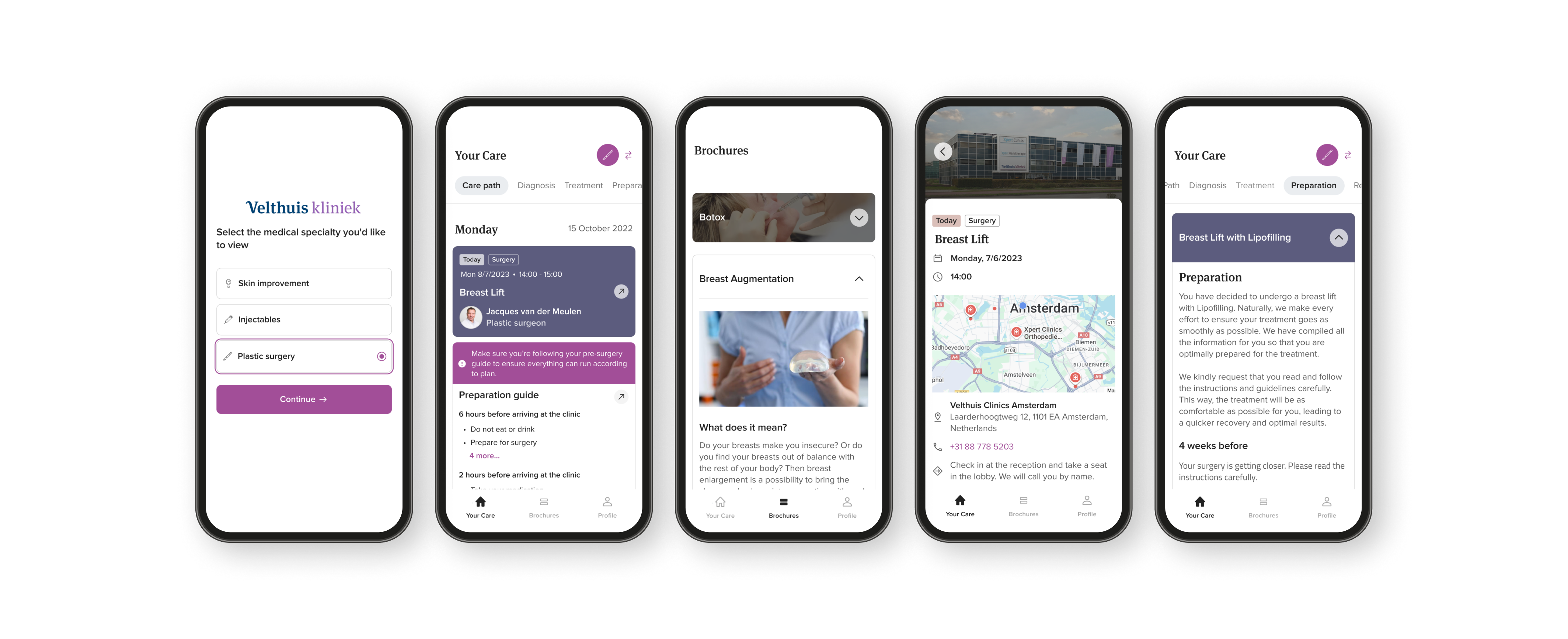
One of Equipe's clinics, Velthuis, required an entirely different brand style. Having a scalable design system made it significantly faster and easier to design separate components for different use cases.
07. Design System & 2025 Rebrand
Building for consistency and surviving a rebrand
Early in the project I established design system foundations that were later expanded significantly. When Equipe underwent a brand refresh in 2025, the token-based architecture meant the rebrand could be implemented efficiently, without touching core product logic.
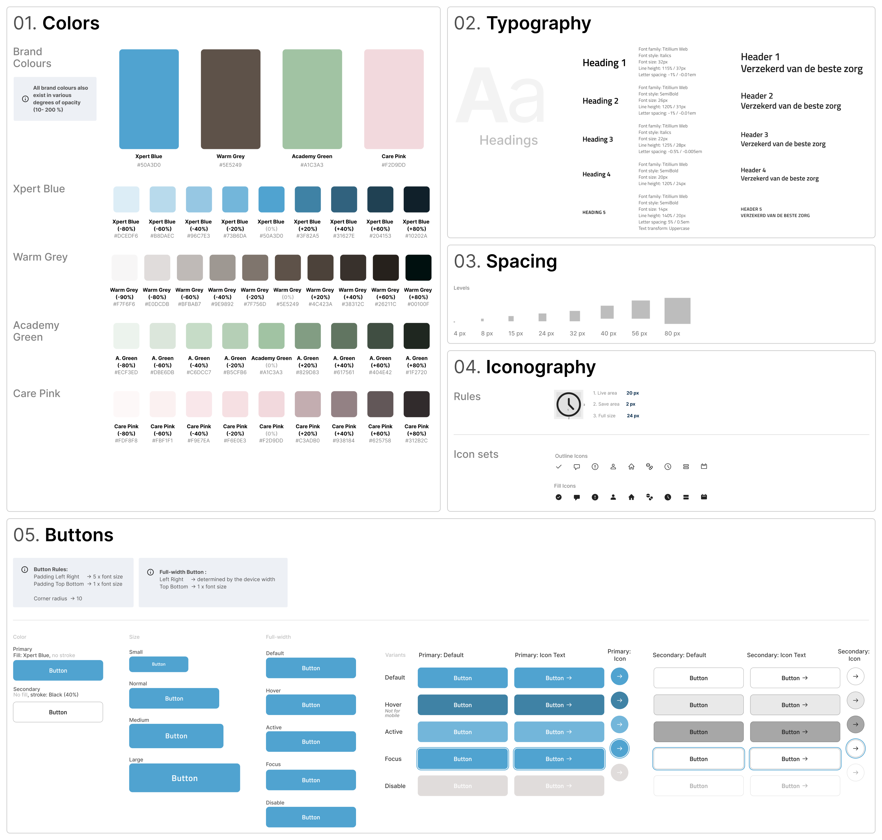
Rather than treating the rebrand as a surface-level visual update, I approached it as a systems-level evolution, interpreting static brand assets for responsive environments, adapting typography for WCAG compliance, and redefining colour usage to meet accessibility contrast standards.
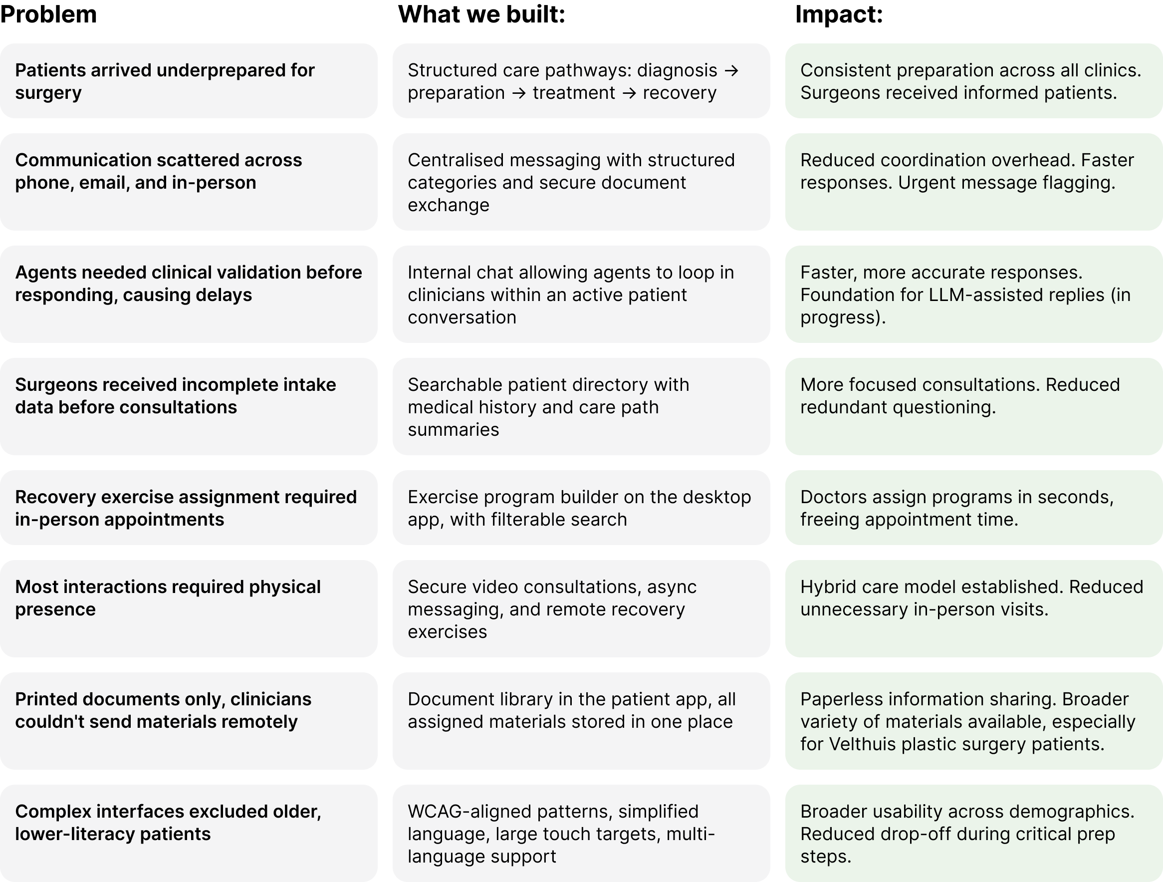
08. Feature Evolution
Problems we addressed over two years
Throughout the project scope evolved continuously. Below is a summary of the key problems we tackled, what we built, and the impact.
09. Reflection
What this project taught me
Working on this for over two years, across a live product, a growing organisation, and a full rebrand, was formative. The core challenge I'd framed at the start remained a useful compass even as scope expanded significantly.
Design for systems, not screens
The most impactful decisions weren't individual UI choices, they were structural. How information flows, how roles connect, how data is shared.
Small structural decisions have outsized effects
In healthcare especially, a poorly structured intake form or an unclear care step has real consequences downstream. Clarity compounds.
Accessibility shouldn't be retrofitted
Embedding inclusive design principles into the token system and component library from the start meant accessibility scaled with the product, not against it.
When constraints are tight, find solutions that fit
Clinical environments limit traditional research. Deep stakeholder immersion and rapid iteration proved equally effective for confident decision-making.
A rebrand is a systems test
The 2025 rebrand validated the design system investment. Updating token values once and watching the entire platform adapt was a meaningful outcome of careful early architecture.
Healthcare requires workflow fluency
Completing the medical software course alongside this work gave me language and framing I likely wouldn't have developed from design alone.
→
Back to home
Equipe Zorgbedrijven
Digital Care Platform for Surgical Patients
Designing a hybrid care platform for surgical pathways
Team: 1 Lead Design, 1 Content, 5 Eng
Clinics Served: 40 across the Netherlands
Duration: 2+ years, end-to-end
01. The Problem
Fragmented care across dozens of clinics
Equipe wanted to move from traditional in-clinic medical care to a hybrid digital-first model that allowed patients to better prepare for their treatments and find all relevant medical information they need.
However:
- Patient communication was fragmented
- Pre-operative preparation was inconsistent
- Clinics lacked structured digital workflows
- There was no centralised patient directory
This resulted in:
- Increased admin and help centre desk load
- Missed information
- Lower patient confidence before and after surgery
Going into this project, it seemed that our high-level goal was clear:
Design a secure, accessible digital platform that supports patients before and after surgery while integrating seamlessly into clinic workflows.
02. Role & Scope
Lead designer, post-discovery through implementation
I joined after the initial discovery phase and owned design end-to-end, from shaping strategy through to engineering handoff and iteration in production.
My responsibilities:
- Defined the design strategy
- interpreted research with patients and clinicians
- Designed patient and clinician interfaces
- Established early design system foundations which was later expanded significantly
- Facilitated cross-functional workshops
- Supported implementation with engineering
I worked closely with:
- Surgeons
- Clinic coordinators
- Engineers
- Product stakeholders
💡 I also completed an Introduction to Medical Software course during this project, deepening my understanding of clinical workflows, regulatory constraints, and patient safety considerations.
03. Discovery & Insights
Embedding research within clinical constraints
Approach
Before designing features, I focused on understanding clinical workflows and patient anxieties around surgery and clinical procedures. Due to regulatory and operational constraints within clinical environments, formal user research opportunities were limited during early phases.
To mitigate this, I embedded discovery into ongoing collaboration with surgeons, coordinators, and support agents.
This included:
- Patient journey mapping
- Review of existing documentation and care flows
- Documentation audits
- Continuous feedback loops during rollout
- Iterative validation through live usage
As much as I would have liked more time and resources to support research phases more fully, I found that rapid iteration and stakeholder immersion were effective enough for me to make design decision confidently.
A few Key Insights identified early on:
- Patients felt uncertain and underprepared before surgery
- Clinics relied heavily on manual and fragmented forms of communication
- There was no standardised digital workflow across clinics
- Surgeons needed structured patient data before consultations
- Accessibility was critical due to varied patient demographics
04. Framing & Strategy
Reframing the challenge
Based on discovery, I reframed the challenge:
From: “Build a standardised and cohesive patient app.”
To: “Design a connected digital care system that supports both patient confidence and clinical efficiency.”
💡 The shift from "app" to "system" was significant. This wasn't a product problem, it was an infrastructure problem. Both sides of the clinical relationship needed to be designed simultaneously.
Strategic priorities:
- Centralised communication: One place for patients and clinic staff to exchange information securely
- Structured intake & triage: Ensure surgeons receive complete, organised patient data before every consultation
- Scalable multi-clinic workflows: Design for 40 clinics with varying needs, without 40 separate solutions
- Accessibility-first: Ensure usability across a wide range of ages, languages, and digital confidence levels
05. Design Execution
Features built across two years
Above you can see how our product evolved over time. We often worked on multiple features simultaneously which required our team to develop reliable workflows and a strong sense of trust that helped us in times of rescoping.
Some of the most significant areas of work included:
Care Pathways
Guided care journeys for patients
Patients lacked a clear picture of what to expect before, during, and after surgery. We redesigned the care journey into a structured, step-by-step experience inside the app.
Communication system
Centralised messaging: for patients, agents, and clinicians
The most complex feature: a three-way communication system where patients could message their clinic, support agents could loop in clinicians via internal chat, and everyone had full contextual visibility.
Clinician tools
Patient directory & admin dashboard
Surgeons had no reliable way to access patient history before a consultation. I designed a structured, searchable patient directory and clinician dashboard that standardised information access across all clinics. I also implemented functionality on the clinician desktop app that therapists could use to assign recovery exercises or build exercise programs for patients post-treatment. Later this was also improved upon by implementing filterable search feature to make it easier to find exercises.
Accessibility
Designing for a wide demographic
Patients ranged from younger, digitally confident adults to older patients with limited tech experience. Complex interfaces would actively exclude a significant portion of the user base.
06. Outcomes
What we shipped and what it changed
Quantitative Impact
- Thousands of patients onboarded to our new system
- Reduced admin overhead
- Increased consistency from preparation through to recovery
- Established robust design system that was easily adapted when the company decided to rebrand in 2025*.
- rating on app store went from 2.5 to 4.6
Qualitative Impact
- Improved patient confidence
- Better surgeon preparedness
- Established digital foundation for expansion
- Standardised workflows across clinics
One of Equipe's clinics, Velthuis, required an entirely different brand style. Having a scalable design system made it significantly faster and easier to design separate components for different use cases.
07. Design System & 2025 Rebrand
Building for consistency and surviving a rebrand
Early in the project I established design system foundations that were later expanded significantly. When Equipe underwent a brand refresh in 2025, the token-based architecture meant the rebrand could be implemented efficiently, without touching core product logic.
Rather than treating the rebrand as a surface-level visual update, I approached it as a systems-level evolution, interpreting static brand assets for responsive environments, adapting typography for WCAG compliance, and redefining colour usage to meet accessibility contrast standards.
08. Feature Evolution
Problems we addressed over two years
Throughout the project scope evolved continuously. Below is a summary of the key problems we tackled, what we built, and the impact.
09. Reflection
What this project taught me
Working on this for over two years, across a live product, a growing organisation, and a full rebrand, was formative. The core challenge I'd framed at the start remained a useful compass even as scope expanded significantly.
Design for systems, not screens
The most impactful decisions weren't individual UI choices, they were structural. How information flows, how roles connect, how data is shared.
Small structural decisions have outsized effects
In healthcare especially, a poorly structured intake form or an unclear care step has real consequences downstream. Clarity compounds.
Accessibility shouldn't be retrofitted
Embedding inclusive design principles into the token system and component library from the start meant accessibility scaled with the product, not against it.
When constraints are tight, find solutions that fit
Clinical environments limit traditional research. Deep stakeholder immersion and rapid iteration proved equally effective for confident decision-making.
A rebrand is a systems test
The 2025 rebrand validated the design system investment. Updating token values once and watching the entire platform adapt was a meaningful outcome of careful early architecture.
Healthcare requires workflow fluency
Completing the medical software course alongside this work gave me language and framing I likely wouldn't have developed from design alone.