→
Back to home
EVO
Property Management Platform for Landlords, Tenants, and Contractors
Project: Evo
Product: Living App, Trades App & Manager Dashboard
Role: Lead Product Designer
Timeline: 1+ year(s)
Team: 1x lead design, 6x dev, 1x project manager
EVO is a UK based property technology company with three main user groups: landlords, tenants, and contractors. Each group uses its own application with different needs and tasks. I was the sole designer responsible for the UX and UI of all three products, covering the Living App, Services App, and CMS. I redesigned existing features, created new ones, and built the design system that now supports all applications.
01. The Problem
Three apps. Three user groups. No shared foundation
EVO's platform had evolved product-first: features were added as they were needed, across three apps, without a unified design strategy.
Each app served a completely different mental model: a resident reporting a leak, a tradesperson managing their job queue, a property manager tracking compliance across hundreds of units.
The result was an ecosystem that worked in isolation but felt disconnected and couldn't scale.
🏠 Resident: Report issues fast, track progress, receive updates
🔧 Tradesperson: Manage job queue, access property details, log work
📊 Property Manager: Oversee portfolios, ensure compliance, coordinate jobs
02. Role & Scope
Lead designer, post-discovery through implementation
I was responsible for all design across EVO, from initial information architecture and user journeys through to final UI, component documentation, and engineering handoff. The challenge was maintaining quality and coherence while keeping pace with an active development team.
Responsibilities
- End-to-end UI design across web and mobile
- Information architecture for all three apps
- User flows and interaction design
- Unified design system and component library
- Design system documentation for engineering
- Iterative feature development
- Cross-functional collaboration with engineering and clients
03. Framing & Strategy
One systems. Three experiences.
The distinction mattered. Treating them as separate products meant perpetuating divergence. Treating them as one platform meant every design decision could compound, shared tokens, shared components, shared principles. Work done once, applied everywhere.
04. Core User Journey
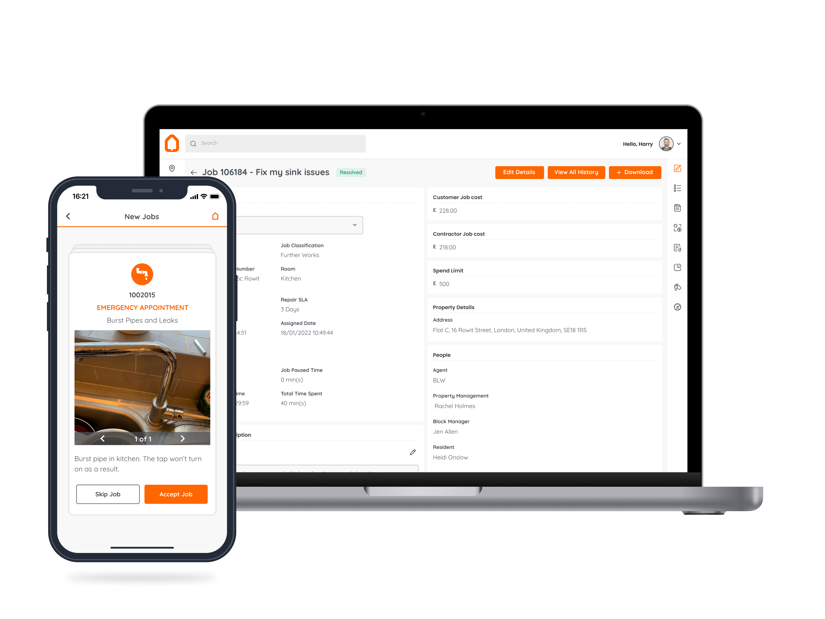
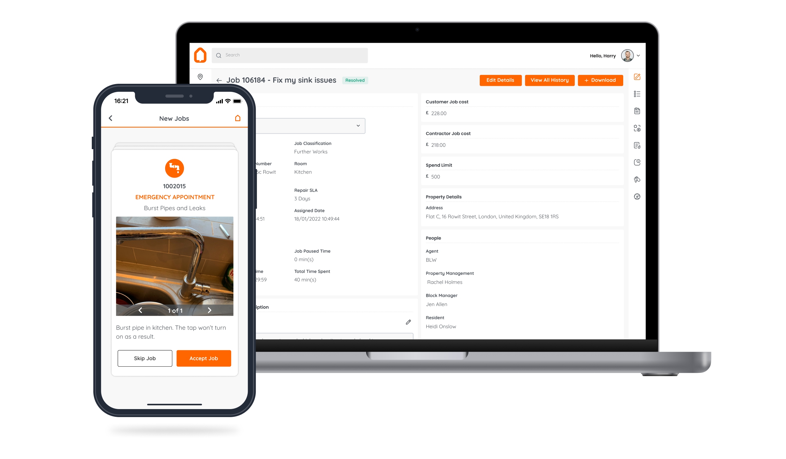
The repair workflow: across all three apps
The defining interaction on the platform is a maintenance request. This single workflow touches all three user groups and was a key area of design focus, it needed to feel simple for residents, functional for tradespeople, and transparent for managers.
05. Design Execution
Designing three apps in parallel
Work happened simultaneously across all three apps. The key discipline was sequencing: establish the shared foundation first, then apply it, rather than designing each app independently and trying to retrofit consistency.
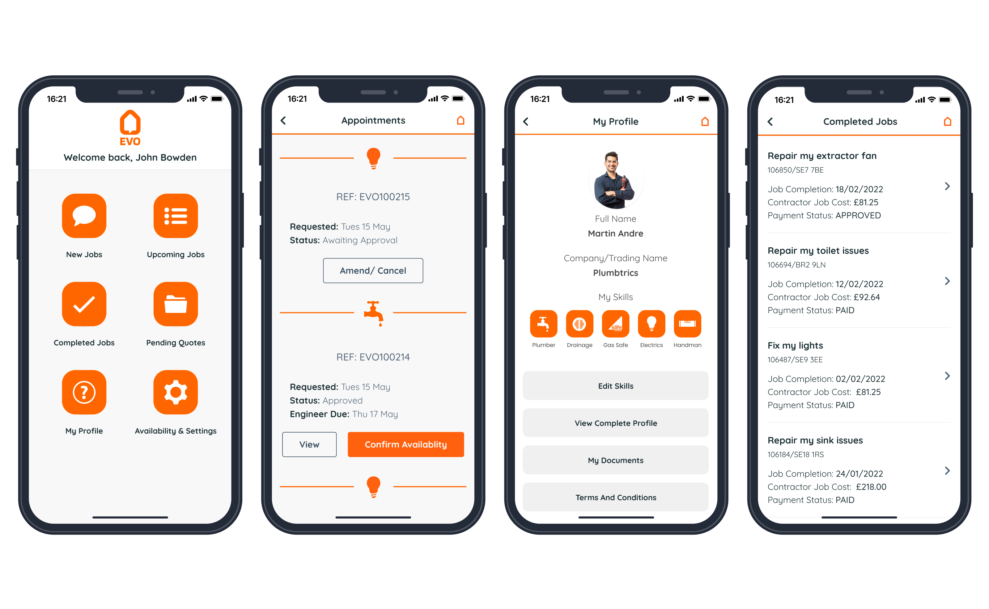
Living App: Residents
Making maintenance reporting frictionless
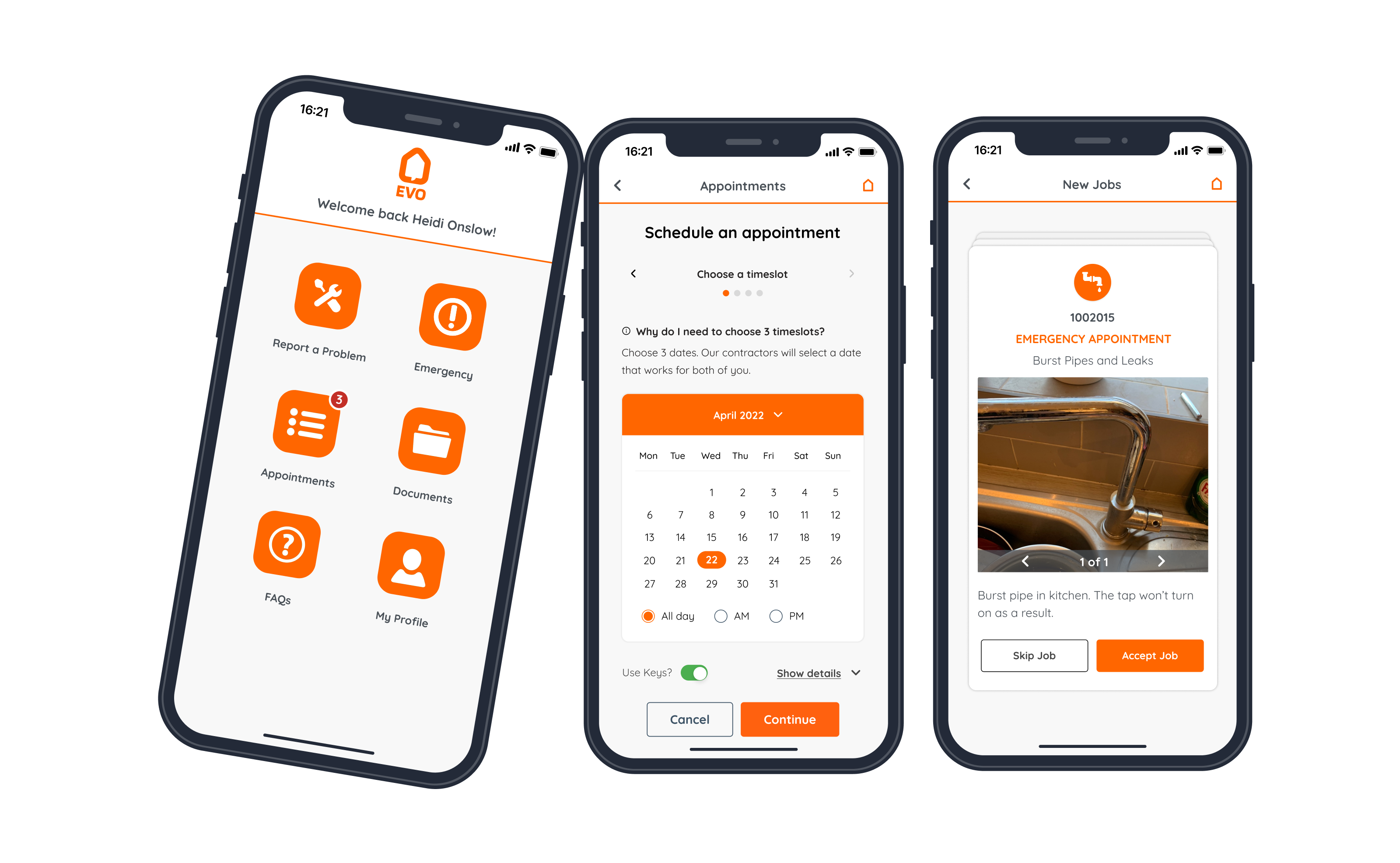
The resident experience needed to be as simple as possible. A significant portion of residents had limited tech confidence so any friction in the reporting flow would result in issues going unreported, or calls to the property manager instead.
The core goal: report a problem in under 30 seconds. This shaped the entire IA: minimal steps, clear progress cues, and a confirmation state that gave residents confidence their issue had been received.
We needed:
- Progress visibility
- Key exchange built in
- Accessible interaction patterns
Trades App: Tradespeople
A job management tool built for the field
Tradespeople work on their phones, often in low-connectivity environments, moving between multiple jobs daily. The interface needed to surface the right information at the right time: job details, property records, and access instructions without hunting through menus.
System requirements:
- Prioritised job queue
- Centralised property records
- Job logging with history
- Mobile-optimised
CMS / Dashboard: Property Managers
Portfolio oversight at any scale
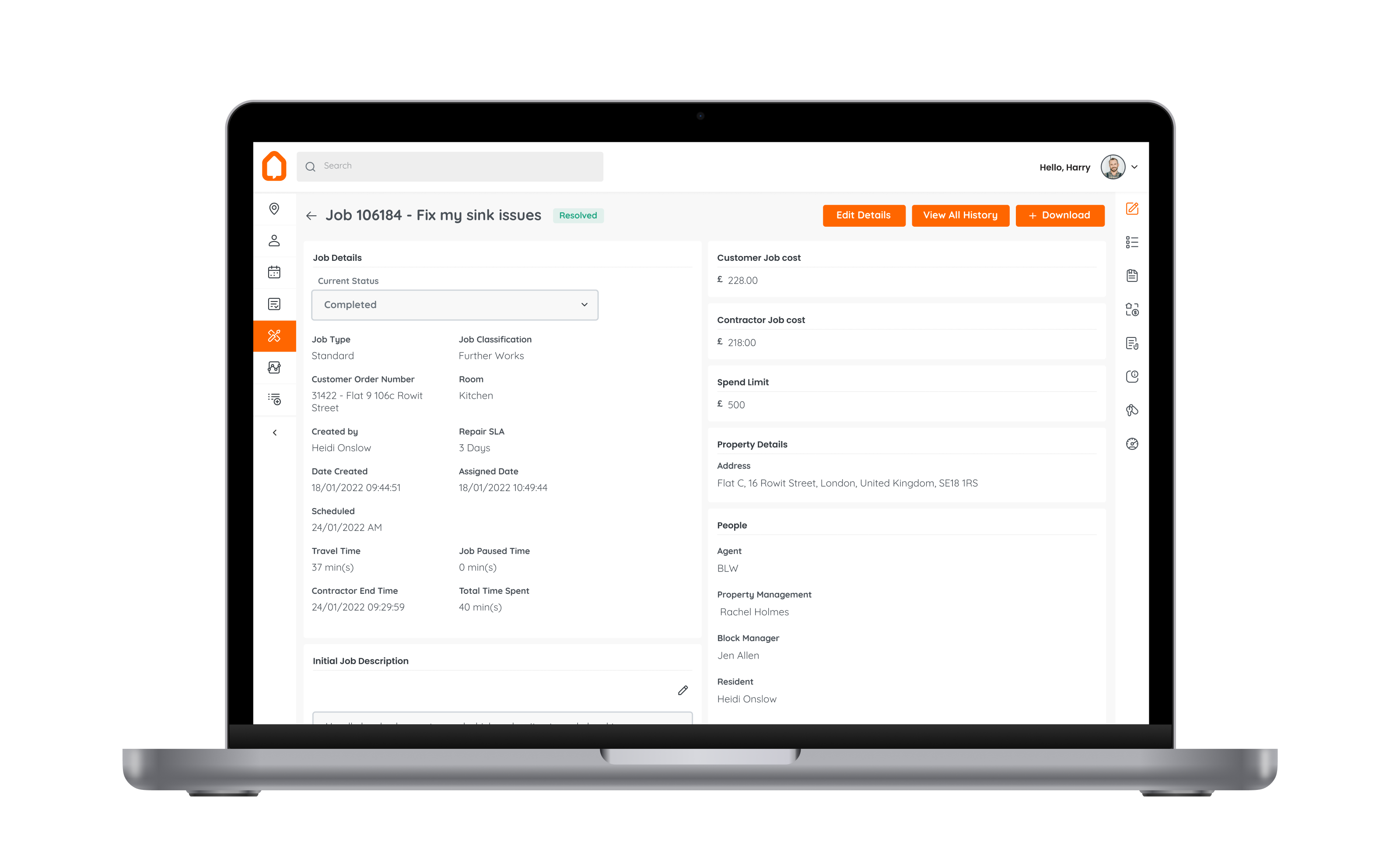
Property managers oversee anywhere from a handful of units to 10,000+. The dashboard needed to scale, presenting a clear picture of active jobs, compliance status, and contractor coordination without drowning in data.
I refined the information architecture to prioritise action over reporting: what needs attention now, what's in progress, and what's resolved.
System requirements:
- Scales to 10,000+ properties
- Compliance tracking
- Contractor coordination
- Audit trail per property
Design System
The shared foundation that made the rest possible
A token-based design system underpinned everything. Building this first, before diving into app-specific UI, meant that decisions about colour, spacing, type, and interaction compounded across all three apps rather than diverging further.
System requirements
- Form elements and inputs (web + mobile)
- Status and notification patterns
- Card and list components
- Navigation patterns per platform
- Icon set and illustration style
- Motion and transition guidelines
- Engineering handoff documentation
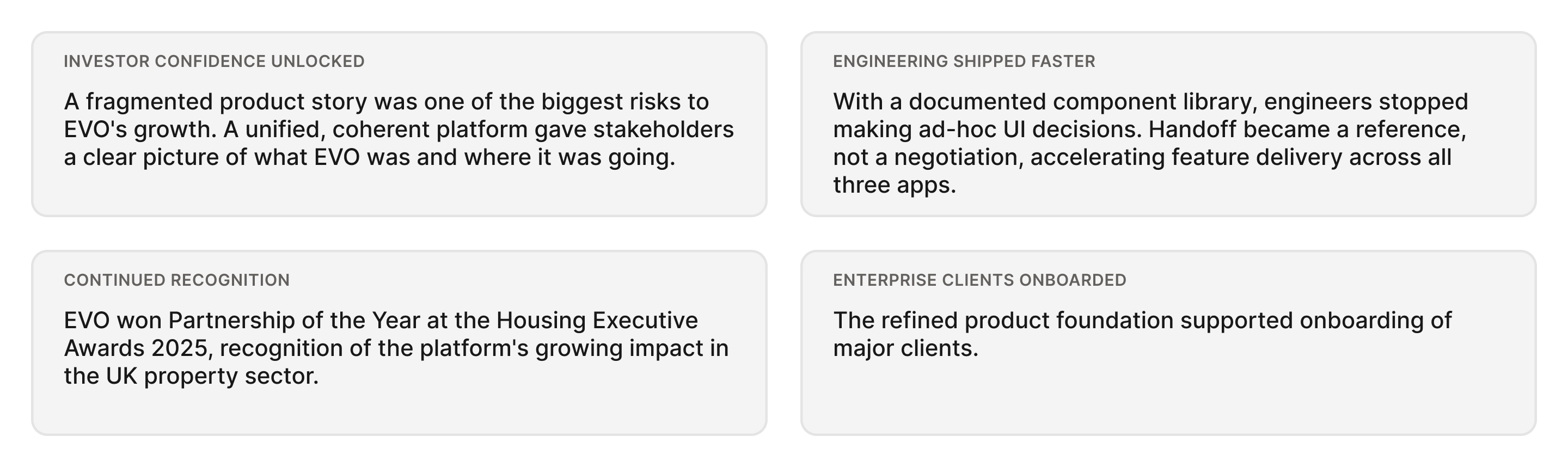
06. Outcomes
What the unified approach delivered
Impact across key areas:
- Design consistency
- Engineering velocity
- Investor confidence
- Cross-app IA coherence
- Scalability of design system
→
Back to home
EVO
Property Management Platform for Landlords, Tenants, and Contractors
Project: Evo
Product: Living App, Trades App & Manager Dashboard
Role: Lead Product Designer
Timeline: 1+ year(s)
Team: 1x lead design, 6x dev, 1x project manager
EVO is a UK based property technology company with three main user groups: landlords, tenants, and contractors. Each group uses its own application with different needs and tasks. I was the sole designer responsible for the UX and UI of all three products, covering the Living App, Services App, and CMS. I redesigned existing features, created new ones, and built the design system that now supports all applications.
01. The Problem
Three apps. Three user groups. No shared foundation
EVO's platform had evolved product-first: features were added as they were needed, across three apps, without a unified design strategy.
Each app served a completely different mental model: a resident reporting a leak, a tradesperson managing their job queue, a property manager tracking compliance across hundreds of units.
The result was an ecosystem that worked in isolation but felt disconnected and couldn't scale.
🏠 Resident: Report issues fast, track progress, receive updates
🔧 Tradesperson: Manage job queue, access property details, log work
📊 Property Manager: Oversee portfolios, ensure compliance, coordinate jobs
02. Role & Scope
Lead designer, post-discovery through implementation
I was responsible for all design across EVO, from initial information architecture and user journeys through to final UI, component documentation, and engineering handoff. The challenge was maintaining quality and coherence while keeping pace with an active development team.
Responsibilities
- End-to-end UI design across web and mobile
- Information architecture for all three apps
- User flows and interaction design
- Unified design system and component library
- Design system documentation for engineering
- Iterative feature development
- Cross-functional collaboration with engineering and clients
03. Framing & Strategy
One systems. Three experiences.
The distinction mattered. Treating them as separate products meant perpetuating divergence. Treating them as one platform meant every design decision could compound, shared tokens, shared components, shared principles. Work done once, applied everywhere.
04. Core User Journey
The repair workflow: across all three apps
The defining interaction on the platform is a maintenance request. This single workflow touches all three user groups and was a key area of design focus, it needed to feel simple for residents, functional for tradespeople, and transparent for managers.
05. Design Execution
Designing three apps in parallel
Work happened simultaneously across all three apps. The key discipline was sequencing: establish the shared foundation first, then apply it, rather than designing each app independently and trying to retrofit consistency.
Living App: Residents
Making maintenance reporting frictionless
The resident experience needed to be as simple as possible. A significant portion of residents had limited tech confidence so any friction in the reporting flow would result in issues going unreported, or calls to the property manager instead.
The core goal: report a problem in under 30 seconds. This shaped the entire IA: minimal steps, clear progress cues, and a confirmation state that gave residents confidence their issue had been received.
We needed:
- Progress visibility
- Key exchange built in
- Accessible interaction patterns
Trades App: Tradespeople
A job management tool built for the field
Tradespeople work on their phones, often in low-connectivity environments, moving between multiple jobs daily. The interface needed to surface the right information at the right time: job details, property records, and access instructions without hunting through menus.
System requirements:
- Prioritised job queue
- Centralised property records
- Job logging with history
- Mobile-optimised
CMS / Dashboard: Property Managers
Portfolio oversight at any scale
Property managers oversee anywhere from a handful of units to 10,000+. The dashboard needed to scale, presenting a clear picture of active jobs, compliance status, and contractor coordination without drowning in data.
I refined the information architecture to prioritise action over reporting: what needs attention now, what's in progress, and what's resolved.
System requirements:
- Scales to 10,000+ properties
- Compliance tracking
- Contractor coordination
- Audit trail per property
Design System
The shared foundation that made the rest possible
A token-based design system underpinned everything. Building this first, before diving into app-specific UI, meant that decisions about colour, spacing, type, and interaction compounded across all three apps rather than diverging further.
System requirements
- Form elements and inputs (web + mobile)
- Status and notification patterns
- Card and list components
- Navigation patterns per platform
- Icon set and illustration style
- Motion and transition guidelines
- Engineering handoff documentation
06. Outcomes
What the unified approach delivered
Impact across key areas:
- Design consistency
- Engineering velocity
- Investor confidence
- Cross-app IA coherence
- Scalability of design system