→
Back to home
Internal Health Platform
Modular Care Path Tooling
I joined a small Reaktor Health initiative to create an internal and reusable care-path platform. The aim was to build a simplified white-label version of the hybrid care model we had delivered for clients previously. This would give the Health BU something concrete to show to potential partners and something they could adapt quickly.
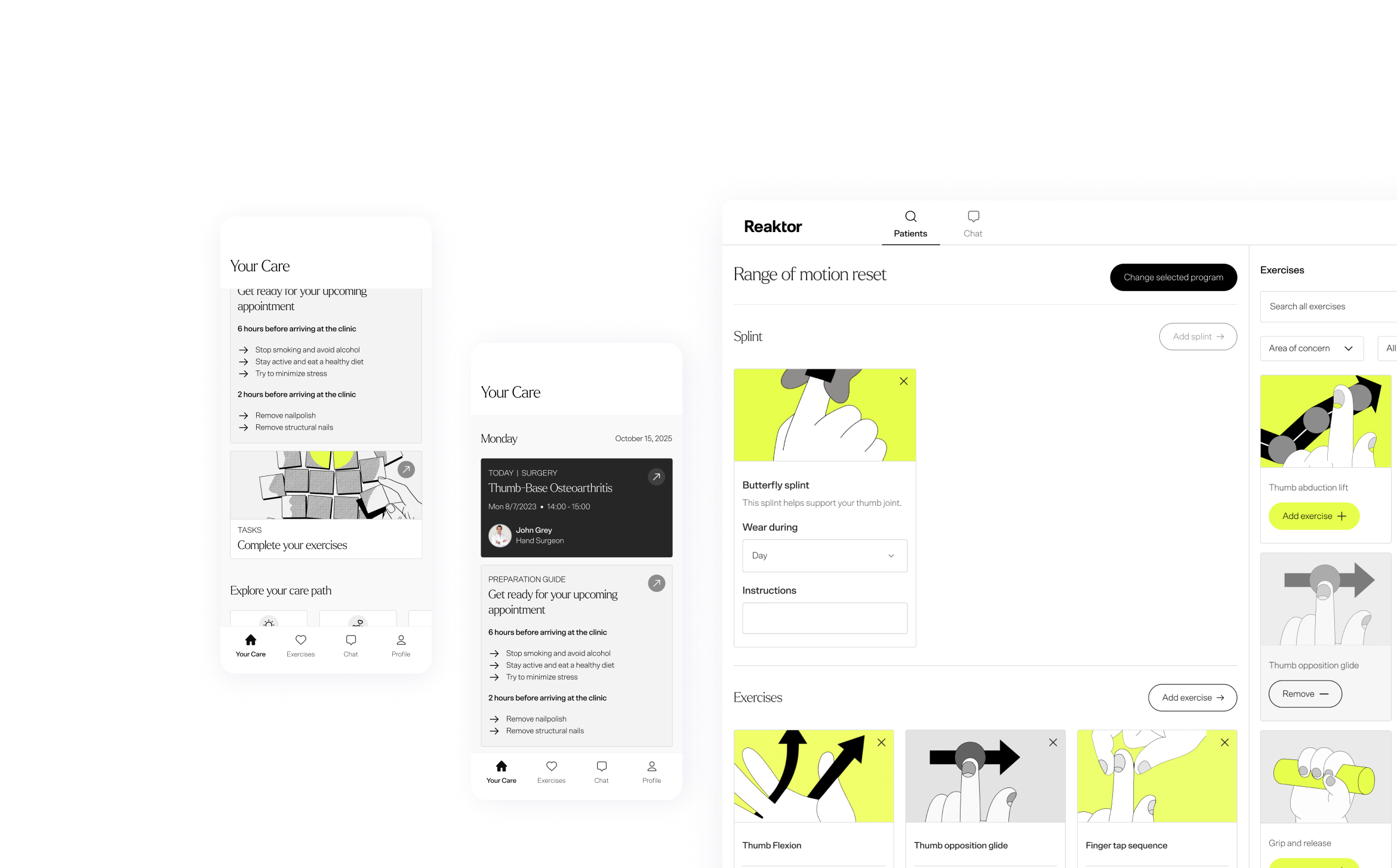
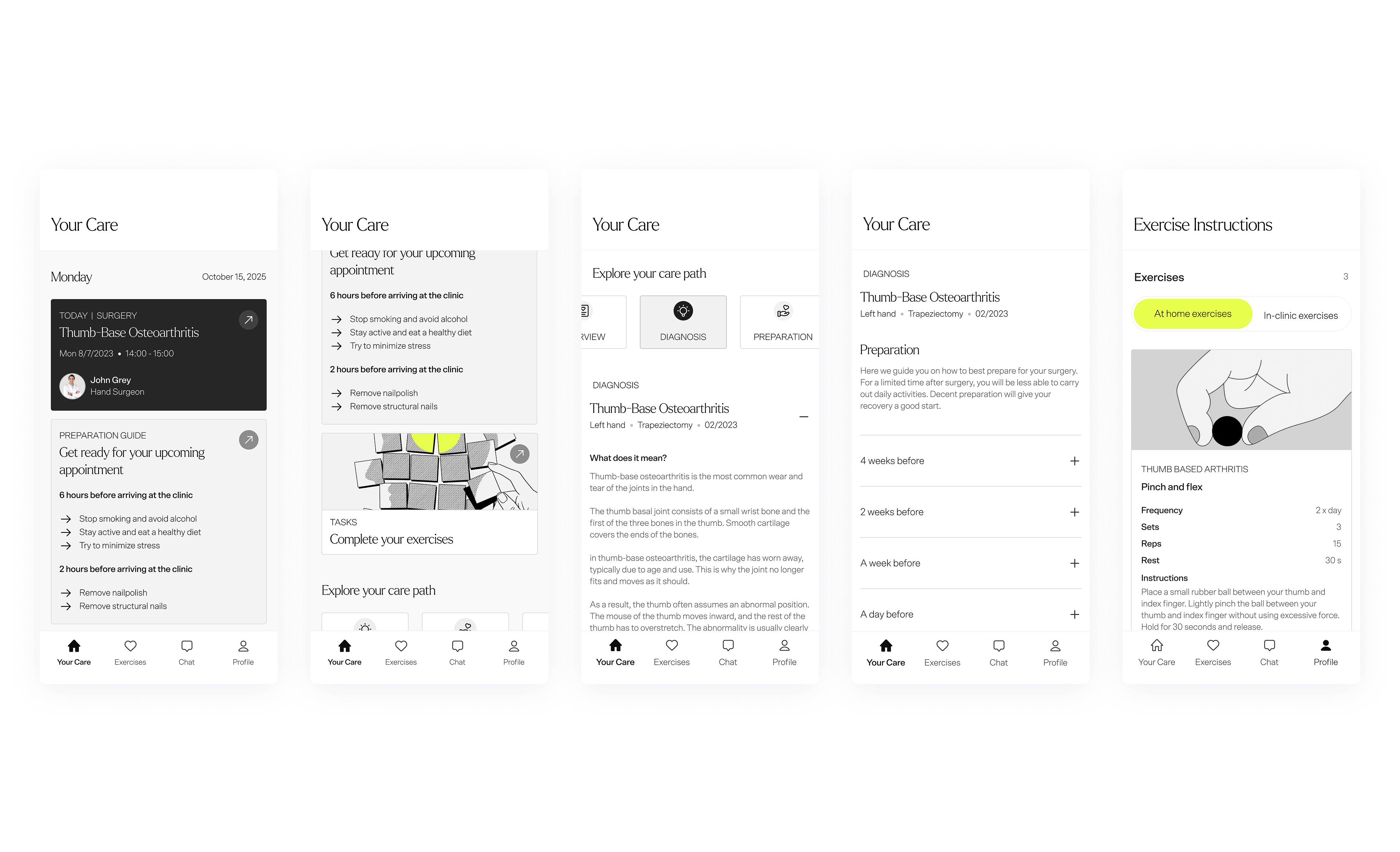
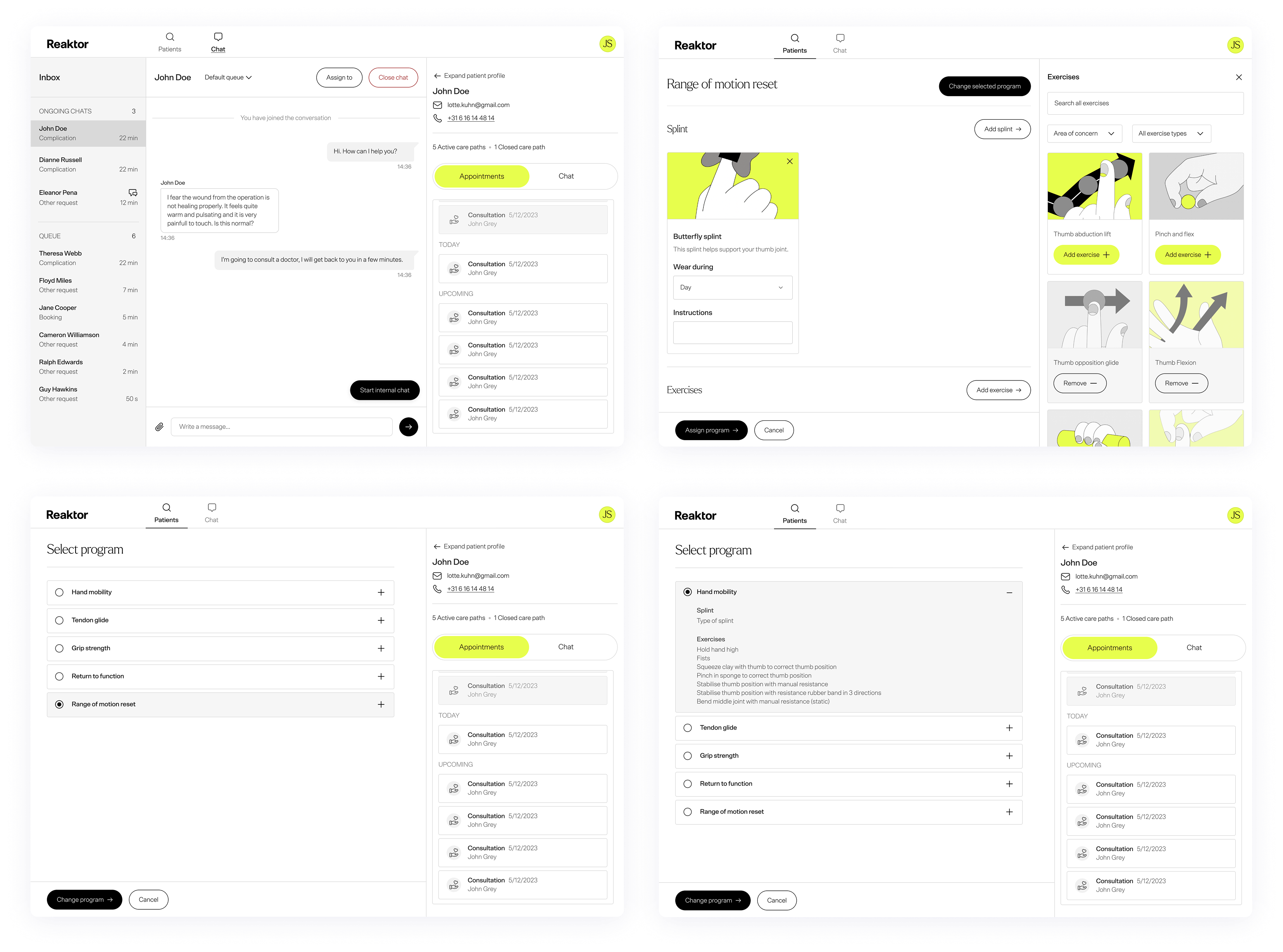
The platform covers the main parts of a typical digital care journey such as preparation, recovery, tasks, communication, and content. Everything was built as a modular system that could be adjusted for different providers, medical areas, and patient groups.
My role
I defined the UX and visual design of the mobile and web applications. This included:
- Designing a modular interface that could support multiple clinical pathways
- Creating a new design system based on Reaktor branding
- Simplifying and improving patterns we had developed during the Equipe project
- Making sure that key patient flows were clear and accessible
- Refining journeys so that the product was scalable and easy for other designers to extend
The work focused on turning real client learnings into a clean foundation that could serve as a product instead of a one-off build.
The challenge
Unlike client projects, this tool needed to:
- Be generic enough to suit different medical contexts
- Be simple enough for demos and quick customization
- Be robust enough to support real clinical pathways
- Be brand-neutral and adaptable to a range of visual identities
The challenge was creating a clear structure and system while leaving room for flexibility.
What I designed
- Core patient flows including preparation, recovery, tasks, and messaging
- A lightweight design system that could be reused across projects
- A visual language based on Reaktor branding
- A set of components and templates that were easy to re-theme
- A mobile-first structure informed by patterns that had worked well in previous projects that were similar.
Impact
- Provided the Health BU with a working product to show to potential clients
- Created a reusable design base for future health projects
- Improved and simplified patterns from the Equipe ecosystem
- Allowed teams to show the value of hybrid care without building full custom builds
What I learned
- How to design systems that work across different clinical contexts
- How to generalise complex care flows into a product that can scale
- How to create brand-neutral UI that still feels coherent and practical
- How to balance structure with flexibility
→
Back to home
Internal Health Platform
Modular Care Path Tooling
I joined a small Reaktor Health initiative to create an internal and reusable care-path platform. The aim was to build a simplified white-label version of the hybrid care model we had delivered for clients previously. This would give the Health BU something concrete to show to potential partners and something they could adapt quickly.
The platform covers the main parts of a typical digital care journey such as preparation, recovery, tasks, communication, and content. Everything was built as a modular system that could be adjusted for different providers, medical areas, and patient groups.
My role
I defined the UX and visual design of the mobile and web applications. This included:
- Designing a modular interface that could support multiple clinical pathways
- Creating a new design system based on Reaktor branding
- Simplifying and improving patterns we had developed during the Equipe project
- Making sure that key patient flows were clear and accessible
- Refining journeys so that the product was scalable and easy for other designers to extend
The work focused on turning real client learnings into a clean foundation that could serve as a product instead of a one-off build.
The challenge
Unlike client projects, this tool needed to:
- Be generic enough to suit different medical contexts
- Be simple enough for demos and quick customization
- Be robust enough to support real clinical pathways
- Be brand-neutral and adaptable to a range of visual identities
The challenge was creating a clear structure and system while leaving room for flexibility.
What I designed
- Core patient flows including preparation, recovery, tasks, and messaging
- A lightweight design system that could be reused across projects
- A visual language based on Reaktor branding
- A set of components and templates that were easy to re-theme
- A mobile-first structure informed by patterns that had worked well in previous projects that were similar.
Impact
- Provided the Health BU with a working product to show to potential clients
- Created a reusable design base for future health projects
- Improved and simplified patterns from the Equipe ecosystem
- Allowed teams to show the value of hybrid care without building full custom builds
What I learned
- How to design systems that work across different clinical contexts
- How to generalise complex care flows into a product that can scale
- How to create brand-neutral UI that still feels coherent and practical
- How to balance structure with flexibility